7 Things to Avoid When Picking Colors for a Chart
Selecting the best colors for charts is a lot like seasoning a good meal: a dash can make your flavors pop, but dump in the whole spice rack and you'll leave your guests confused or running for the exit. If you're craving visuals that inform (without overwhelming taste buds or eyeballs), it's time to master what not to do. Here are the top color mistakes to avoid on your quest for chart greatness.
1. Never Go Full Crayon Box.
Just because you have 64 colors doesn't mean you should use them all. Sometimes one, two, or (gasp!) even monochrome says it better. If your chart looks like the aftermath of a Skittles explosion, people will spend more time deciphering the rainbow than your actual data.


2. Don't Let "Brand Colors" Ruin Everything.
Sure, your company orange looks amazing on the website—on a white background. On a chart? Next to the company lime green? It's going to look like a highlighter. Consider what color(s) present the data best before worrying about branding. Stick a small logo or company name in the bottom corner if needed.
3. Don't Ignore the Colorblind.
Red-green combo? Great for Christmas, terrible for inclusivity. Check your palette for accessibility, unless you're running an exclusive chart club (don't). One in twelve men and one in two hundred women are colorblind so it's likely this will affect someone that sees your chart. The main issue is ensuring all your colors have a different contrast for people who can't see colors (another reason to keep your color choices simple). Try this tool to test colors: https://projects.susielu.com/viz-palette
4. Don't Use Neon Unless You're Making a Rave Flyer.
Blinding colors might grab attention. But so does a fire alarm, and nobody likes that either. But don't go the other way either. Light gray on… lighter gray? Only your most eagle-eyed intern will see any of it.
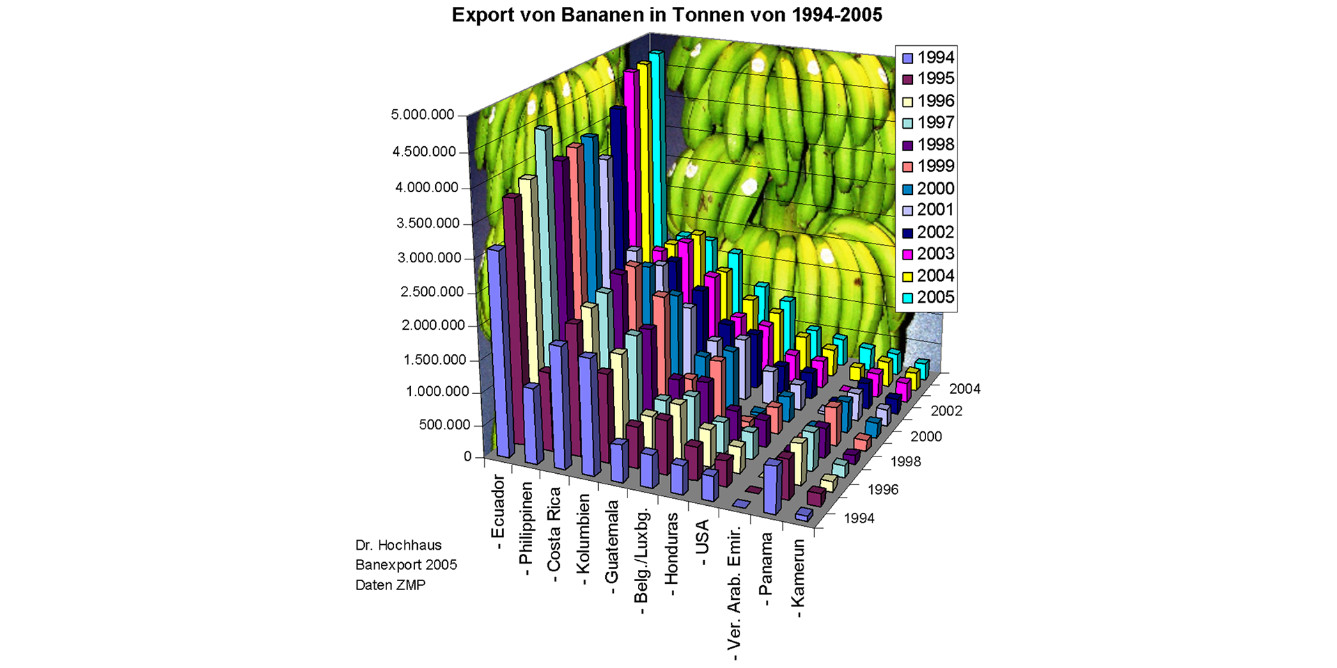
Also in 99.9% of cases there is no reason to use 3d effects on your charts. It just makes them hard to read.

5. Don't Assign Meaning Without… Meaning.
Using red for something good and green for danger? you're pretty much begging for confusion. Keep your colors sensible.
A lot of charts settle for using color purely as a way to separate categories, but color can do so much more!
In sequential charts, you can use a gradient: lighter shades for lower values and darker shades for higher ones, instantly showing the direction and intensity of change.

For data that has a critical midpoint (like zero), try a diverging palette: use a neutral color like gray for the center, then shift to darker hues of one color for increases and another for decreases. This way, your chart's colors actually tell a meaningful story, not just a pretty one.

6. Don't Forget to Test in Grayscale.
Print-outs still exist. That subtle color change your chart depends on? It's mud now. Try your chart in grayscale—if it still makes sense, you're golden.
7. Don't Change Your Color Story Mid-Chapter.
Consistency isn't just for parents and dog trainers—it matters for charts, too. If "profits" are blue in Chart 1, don't make them orange or purple in Chart 2 on the same page. Unless you're intentionally confusing your audience, pick a color scheme and stick with it.
If you want a simple way to design charts with great pre-built color palettes, check out SnappyCharts, the easiest way to build charts to export as images or embed them in your website.
Pre-built Color Schemes
Here are some of our pre-built color schemes that you can use in your charts: