How to Pick the Right Chart Type for Your Data
If youve ever stared blankly at a "choose chart type" menu, youre not alone. Whats the first choice made between making a good chart and a bad one? Picking the right tool for the job! Heres a no-jargon guide on when to use bar, line, scatter, pie/doughnut, polar area, and radar charts; plus quick, real-life examples for each.
Chart Type Quick Reference Table
| Chart Type | Best For | Example |
|---|---|---|
| Bar | Comparing categories | Subscribers by streaming service |
| Line | Trends over time | Website traffic per month |
| Pie/Doughnut | Percentages of a whole | Budget allocation |
| Scatter | Correlation/relationships | Ad spend vs. sales |
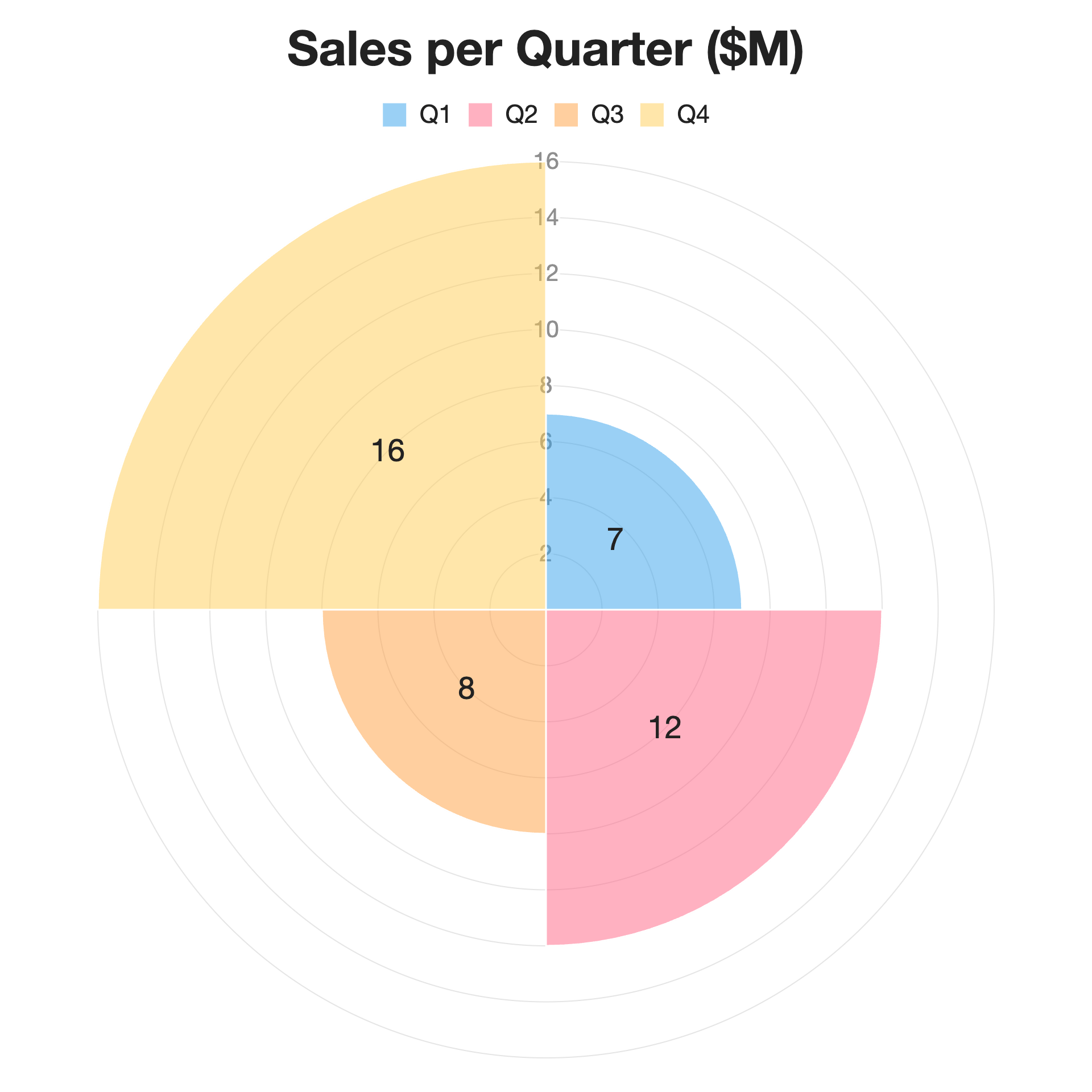
| Polar Area | Circular/seasonal categories | Sales by quarter |
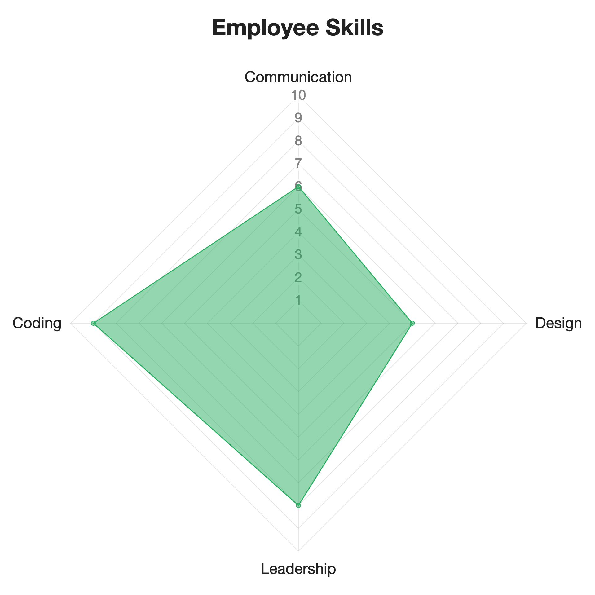
| Radar | Multiple features/traits per category | Skill evaluation |
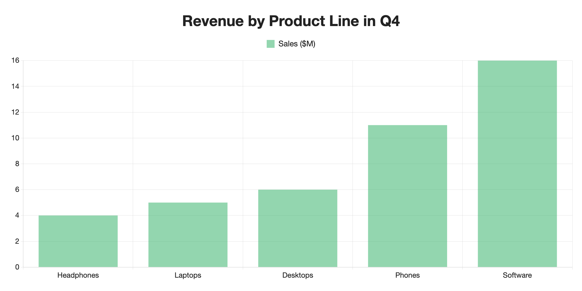
 Bar Charts
When to use:
When you want to compare values across categories.
Best for:
- Rankings ("Top 10 movies by box office sales")
- Names, groups, or distinct items
- Before/after or yes/no comparisons
Example:
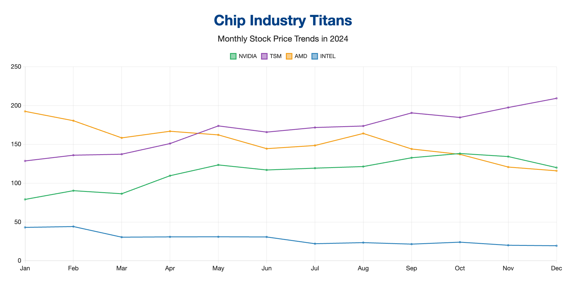
 Line Charts
When to use:
When you want to show change or trends over time.
Best for:
- Stock prices, website visits, monthly sales, etc.
- Anything measured in continuous regular intervals (days, months, quarters)
- Showing patterns (seasonal spikes, growth, decline)
When to avoid:
- You have unrelated categories or groups (use a bar chart instead)
Example:
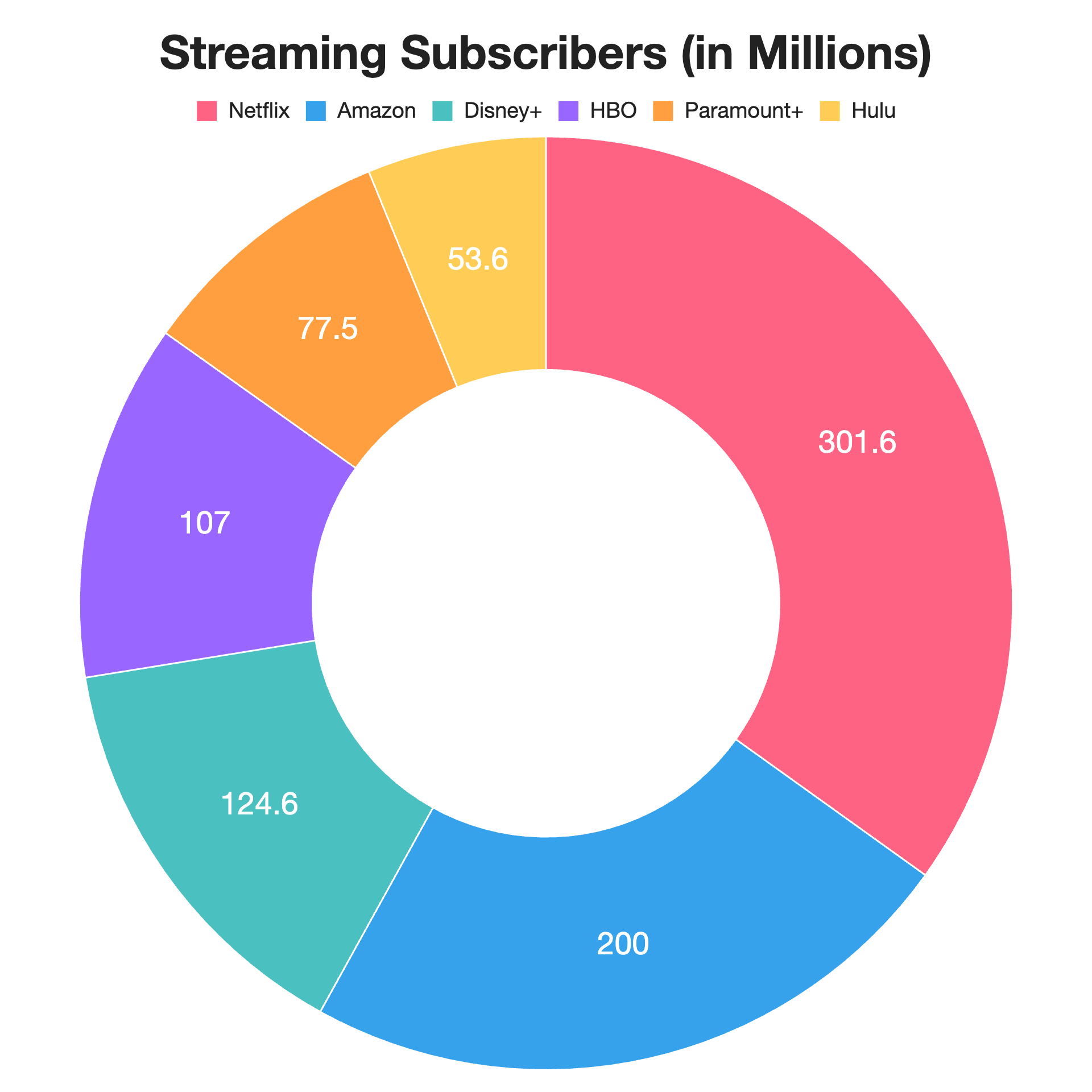
 Pie & Doughnut Charts
When to use:
When you want to show how parts make up a whole, especially if there are only a few categories.
Best for:
- Market share among a few rivals
- Budget breakdowns
- Survey responses ("Which feature do customers love most?")
When to avoid:
- When you have negative/zero values or values that are close to each other
- No more than 5-6 slices (after this, they begin to get confusing)
- In most cases, a bar chart is a better choice and easier to read
Example:
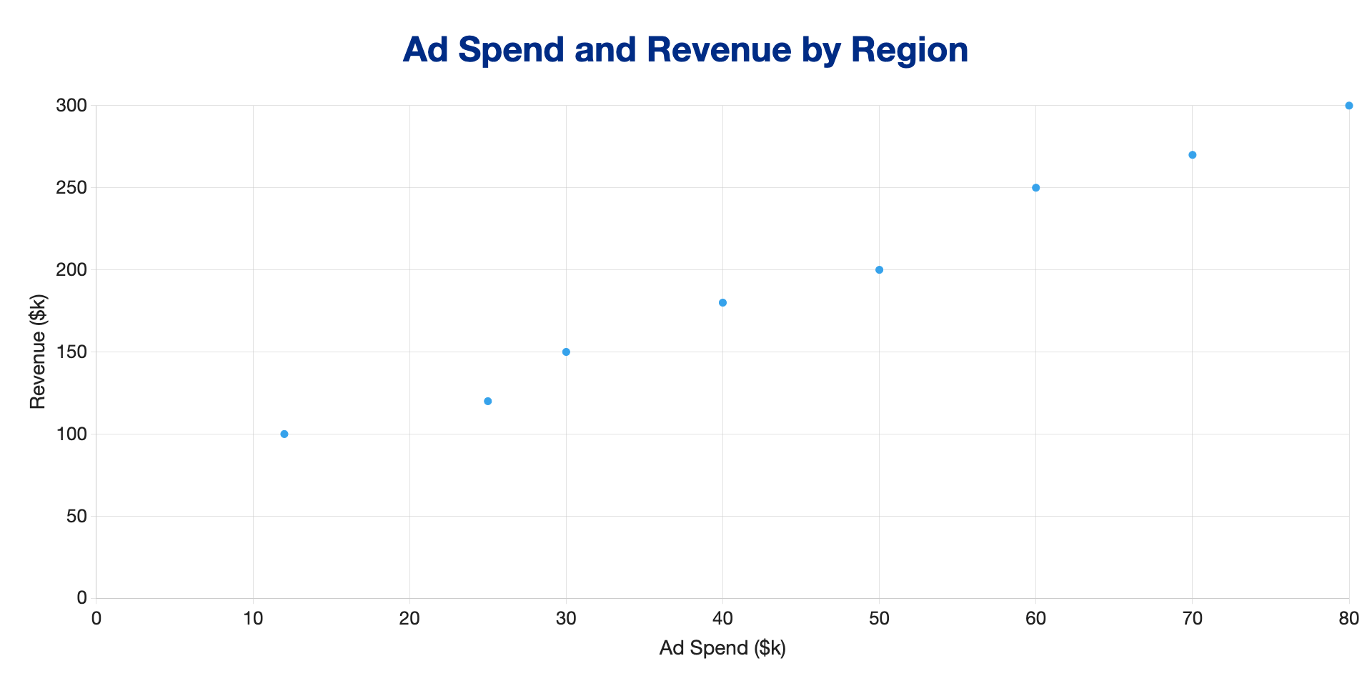
 Scatter Plots
When to use:
When you want to see relationships or patterns between two numeric variables.
Best for:
- Spotting correlation ("Does spending more on advertising lead to more sales?")
- Outliers (biggest spenders, fastest runners)
- Distributions (clumps or clusters)
When to avoid:
- When you don't have enough data points to see a pattern
Example:
 Polar Area Charts
When to use:
When you want to compare categories in a circular format, especially for cyclical data.
Best for:
- Distinct categories (like months) that wrap around (e.g., weather, sales, cyclic phenomena)
- Showing quantities for each
When to avoid:
- Youre not using cyclical data (a bar chart may be a better choice in most cases)
Example:
 Radar Charts
When to use:
When you want to compare values for multiple features/traits on one scale.
Best for:
- Comparing profiles ("Player statistics by skill," "Department strengths and weaknesses")
- Survey results (rate these 1–10)
- Multi-factor evaluations
When to avoid:
- You have many different variables (this makes visualizing and comparing difficult)
- In many cases, a bar chart is a better choice and easier to read
Example:
The Big Idea
Start with your data and your story. Ask, "What relationship or comparison am I communicating?" Pick the chart that spotlights that story, then let SnappyCharts help you build it.
Don't have an account yet? Sign up for free and start building your first chart in minutes.